Abstract marathon...

I took a long run with this painting and managed to capture the journey, so here it is.

The first stages went according to plan…

… but then when I wanted to create some space things got a little weird.

it’s hard to believe it is the same painting I started but them…

…finally I got some clarity when a little bird told me what I should do with it!!

red cardinal

A page a day...

…diary is something I started using at the beginning of this year, and as the year has progressed I’ve found it more and more helpful.

Patty, my sister, told me to write a list every morning - “write the things that need doing no matter how small, and tick them off as you go.”

So, for the first time this year I bought myself a page-a-day diary and I’ve been writing lists on it every day, carrying things over to the next day if I don’t get them done, as well as writing in the things I need to do in advance, like appointments on those days. It’s a great system.

A Busy week

It looked like I might have to miss this weeks blog as I have been so busy this week - I wrote “blog” on my list on Thursday…carried it over to Friday…Sat…it’s now 10:19pm and I’ve completed a painting that I wanted to finished for Monday, and as I have a workshop tomorrow, prepared for that, and had a class this morning that I also prepared for, I needed to do it today…tonight…

a few hours later and it’s done.

Normally I’d retire for the evening by now, I’m reading a good book at the moment “American Dirt” which will probably put me to sleep if I start now, and I need to stay awake until 12pm when I’m picking up daughter no 2 from a party.

The story of the Bison

I needed to paint a painting to replace one that sold in the salon.

“Paint a Bison”, said daughter no 1, so that’s what I did and enjoyed every minute of it too :)

It’s not a very exciting story but the painting itself is exciting which really is testament to the Old Artist’s Proverb - “It’s not what you paint, it’s how you paint it.”

ContinuinG…

…with the visual poetry exploration in-between the other stuff I’m working on. These little poems are, for me, interesting and fun.

Interesting because I’m able to take bits from the past, be them ideas or materials, and marry them with the present. I can weave some kind of story in too, with words. Perhaps I could string them all together into an exhibition, a calendar, a pack cards with recipes on the back, or a book.

Fun because they are small, inexpensive to make and quick to assemble…I can leave them unfinished without worrying about waste, or spend time finishing them depending on how much I’m enjoying the outcome. I can limit the materials I use and create them anywhere, in or out of the studio.

Something old, something new.

The Lobster mornay and creme burlee… they don’t just want to be elected!

The random, abstracted quality of the illustrations allows for some wildly obscure thought, or thought bubbles.

something borrowed

out of lobster., burlee as a concept only

how random can I make this I wonder…

a robot wronged a human as did creme burlee

now there’s a thought - what has humans invented that has been good for the individual, good for the group and good for the environment - like absolutely good with no down side to it whatsoever?

Something blue

the end.

Visual Poetry (Vispo)…

…is a juxtaposition of visual and other art forms, like poetry, performance, typography and storytelling.

“visual poetry works in an intersection between the visual arts and poetic texts.” Says Sarah Jane Crowson

From what I understand, (and to be honest the whole genre is a bit obscure and broad, like poetry itself), the movement originated in the 1920s where poets and artists got together to bend some boundaries. Typography, concrete poetry, asemic writing, sound poetry and digital poetry are some of the sub-categories of Vispo.

Contemporary visual poetry usually includes collage and/or text, and personally I think that these elements create a visual poem when they induce a non-traditional feeling about the subject, and/or add a further descriptive element to the visual experience.

One of my first visual poems was a typographical effort that I printed on a torn out page of an old book, tore that and then photographed it, so my finished work is the actual photographed image.

I also made some visual poem paintings where I included actual poems that I wrote in the paintings.

The Third Oblivion

90x90cm, 2014

Left.

Returned.

A third time indignant trace of

Torn paper bones that

Ached and sighed caught in the rip

Listing the silence

Today…

I’m exploring a smaller (down-sizing) concept of vispo, tiny, some are card sized, poems to conserve and recycle materials. Little reminder poems of how we got here, how things have changed and are changing, and to tribute the joy and pleasure in creating things out of not much, because you don’t need much to create beautiful and interesting things.

Project white on white:

Friday evening and I’ve a class in the morning. I’ll be in the class doing the project and the project is “stillness of white” - a project created by our boss tutor at the little art school I work at - see here. It’s a still life project that is about white on white on white, painting in oils. I’ll teach it later in the week but the purpose of participating in the Saturday morning class is so that I can understand the project and am on the same page as the other tutors at the school.

I’m packing my kit and playing around with white objects.

I need to take my sketchbooks, drawing things and a bit of paint (I like to draw with paint), and some white objects to compose what will become the painting.

objects

I quite like the birdseye view of my pots…problem is that there’s many ways they can be arranged and I like more than a few arrangements.

more objects

I also like the addition of crushed paper, and the gorgeous little round bowl I found in an op-shop yesterday, it’s so fine.

Where to start

the next day, 11:05am - after photographing my still-life (more than a few photos), I want to see how difficult it’s going to be to translate them into a visual work. The quickest way to do this is with some quick sketches using some kind of pencil. A tonal sketch also lets me see how easy the concept is to read. It really doesn’t matter what kind of pencil or pen I use at this stage.

flower in a glass jar is simple and easy to read.

birdseye view of pots is interesting and not as straightforward.

eye view pots are easier to make sense out of than the birdseye view pots. I could also extend the space at the bottom which is handy when choosing a canvas shape.

I will try one in paint next.

quick sketch in paint

…with just a few scrappy marks down made from whatever leftover paint I had in my pallet I can see that this little painting makes sense. A very easy to interpret composition.

The next working…

…requires a fresh pallet with some intention in the colour choices. The theme is white so I’m going to need colours that speak to that, which means that I want to make some greys with enough variation between warm and cools, darks and lights to allow for some subtle tonal sifts.

the next working

Yellow ochre, Burnt Sienna, Mineral blue, midnight blue and white are the colours I’ve put out for my greys.

Next I will do a study of the pots in my sketchbook, or perhaps a larger painting of it on a larger board, 40x40cm, that I’m not precious about to decide on which I will spend more time on which will be my finished painting (hero piece).

A quick sketch in acrylic paint shows me that pots is easy to translate. My hero piece is going to be in oils, so I’ll be able to glaze to get some softness happening to make things more interesting.

I don’t like to repeat myself so rather than do a study of the eye view pots I might do them as my final painting.

for my final painting I’ve painted a square 50x50cm canvas a deep olive green coloured ground to start with. I painted the sides with this as well.

Onto the dark olive green ground I drew up my composition first in chalk - the kind of kids chalk you can get from the supermarket, then I mapped out some tones using a range of blues and brown colours in oil paint.

note the dark coloured ground poking through

I used medium to thin it a little, not solvent because I wanted to be able to move the paint for a long time.

Cerulean blue, ultramarine blue, viridian green, manganese blue hue, sapphire, burnt sienna, raw sienna, red ochre, permanent mauve, Australian green grey, and white.

Using various mixes of these different colours I can get my greys, high, mid and low key greys and warm and cool greys that will create subtle and strong tones as I need them.

My intention with this painting was to show subtle tones and strong tones, subtle colour and temperature shifts in the lightest areas of the painting with some lost edges and interesting brush work. It turned out much like I intended and I didn’t make any mistakes during the painting process.

To finish off and to sate my curiosity I did a little oil alla prima painting of part of one of the photos I took at the composition stage that I rather liked, using the same pallet.

jar of love

30x30cm

Holidays are looming…

…school holidays that is, and although not a huge amount will change for me, there will be enough of a change that I can switch gears and finish a few projects/commissions that I’ve been working on, (well…that’s the plan).

Because I teach/facilitate/tutor some lessons, workshops and/or short courses every week at a lovely little local art school, see here , and a fair bit of prep goes into that, it’s become my priority during the school term. I’ve learnt pretty much everything I know about the teaching process from my boss and mentor Krystyna Ciesiolkiewicz, and then from putting that into practice I’ve developed confidence in transferring knowledge about my craft that I couldn’t have managed all by myself.

I use to be a nervous wreck in front of class where all eyes are on me and I need to speak coherently. Not any more. That’s thanks to Krysh and the years of work and encouraging, correcting, suggesting and commending. We’ve achieved this together.

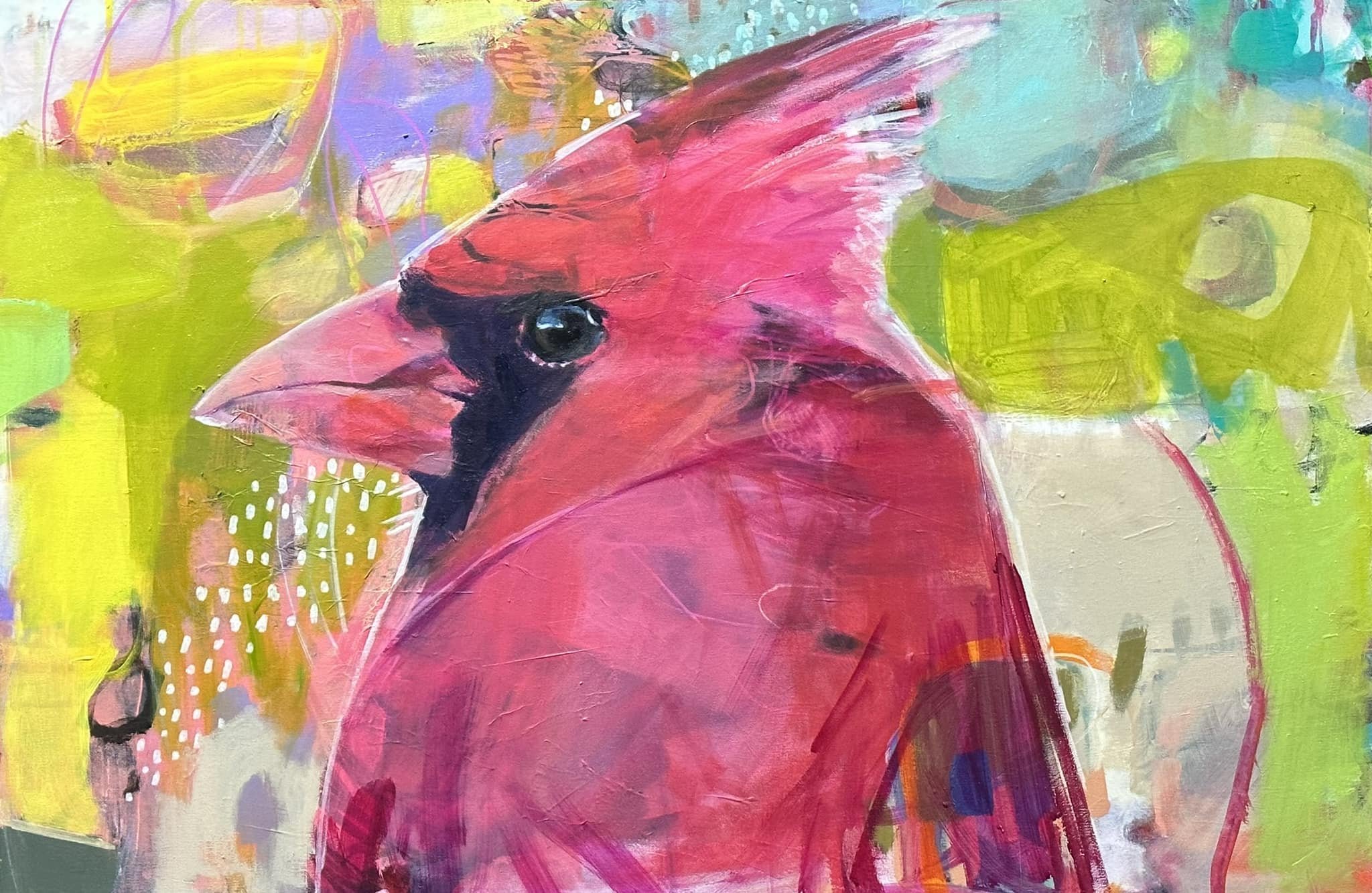
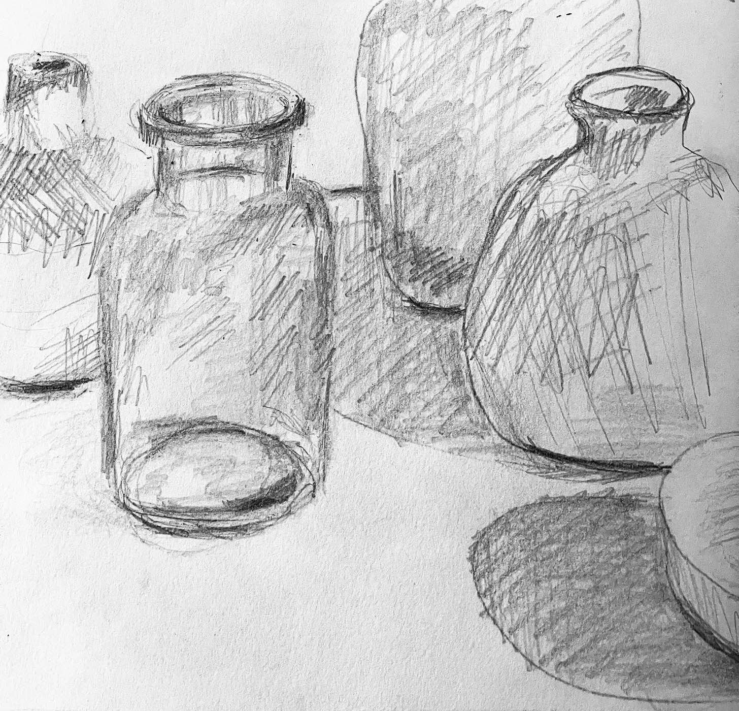
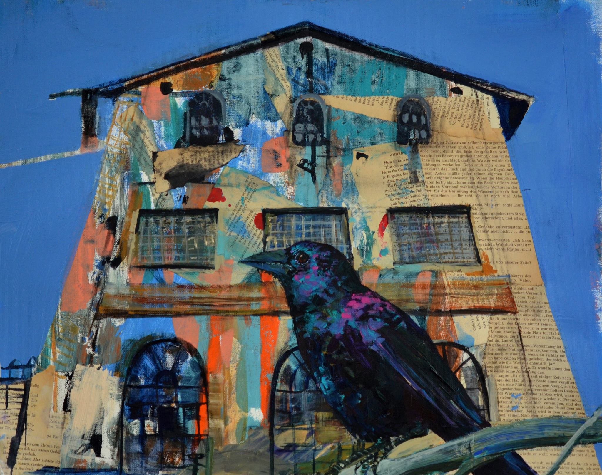
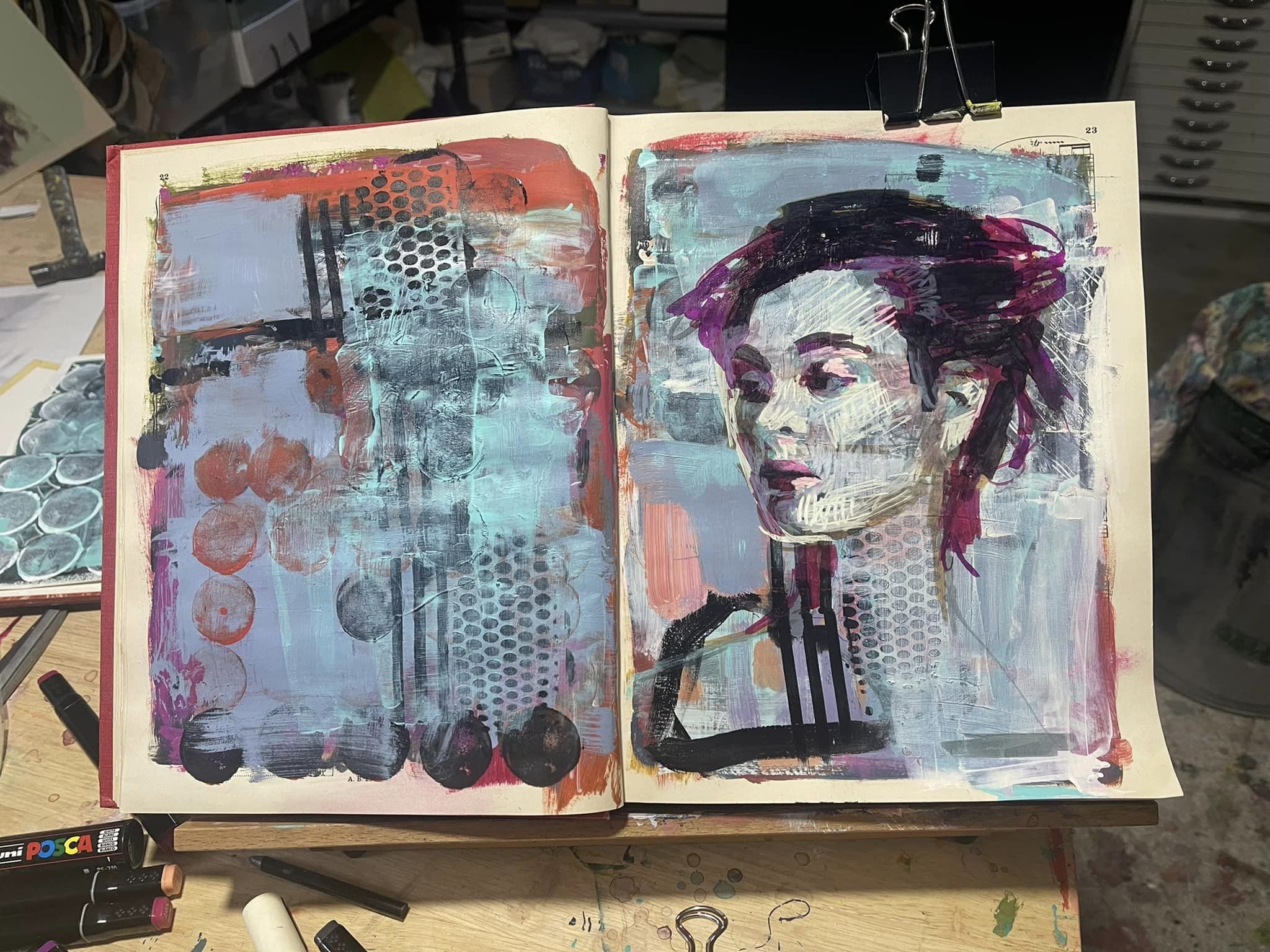
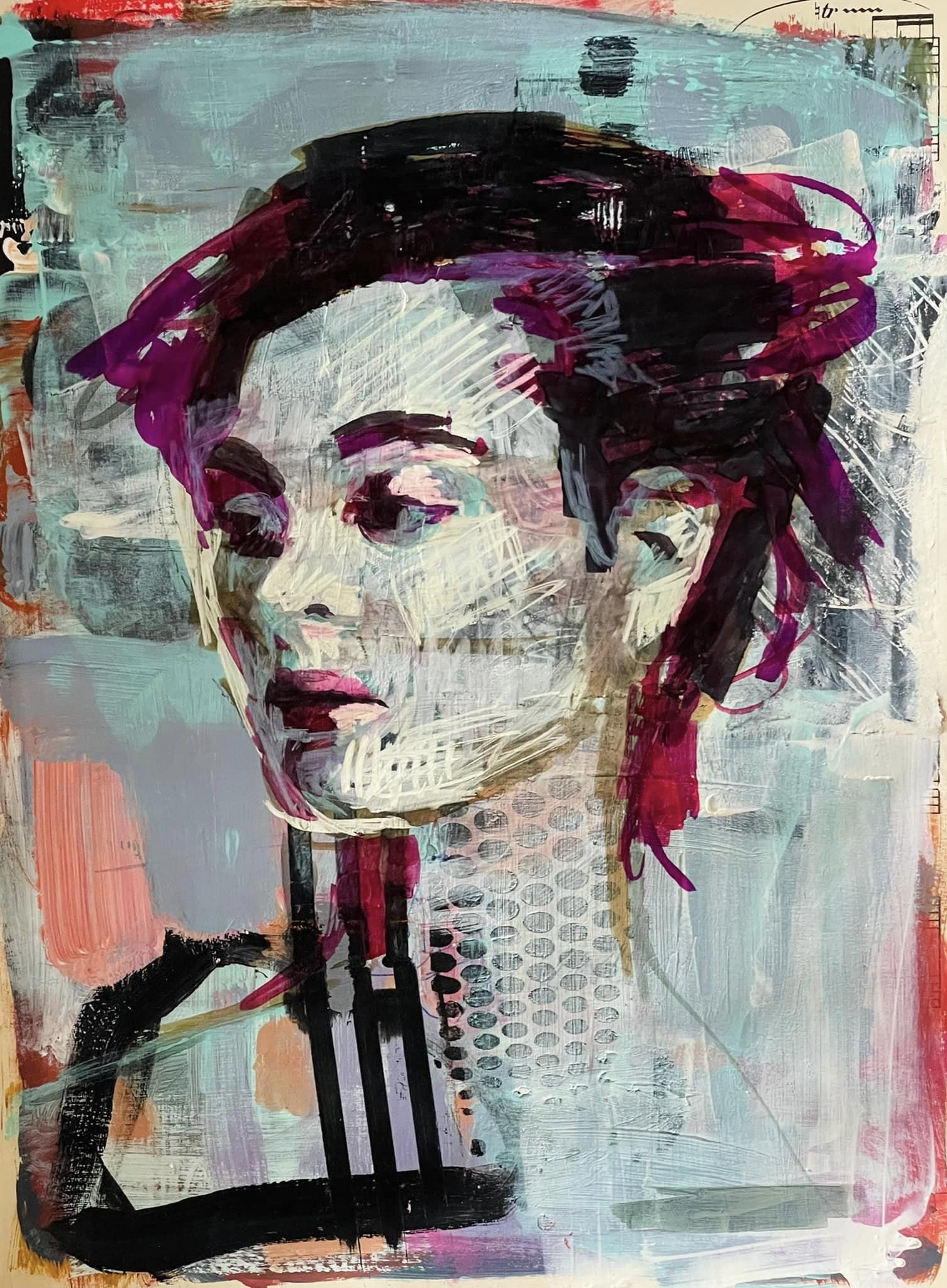
Creating lessons, short courses and workshops has become a passionate endeavour of mine. They are as creative as the paintings themselves and like paintings they evolve. Interestingly, they don’t get bigger but smaller. A 6 week portrait course can evolve into a series of shorter courses, where different aspects of a process can be explored in depth.

“Why choose those colours?”

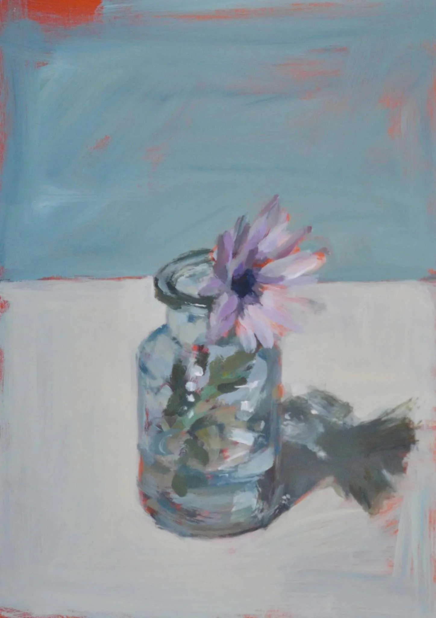
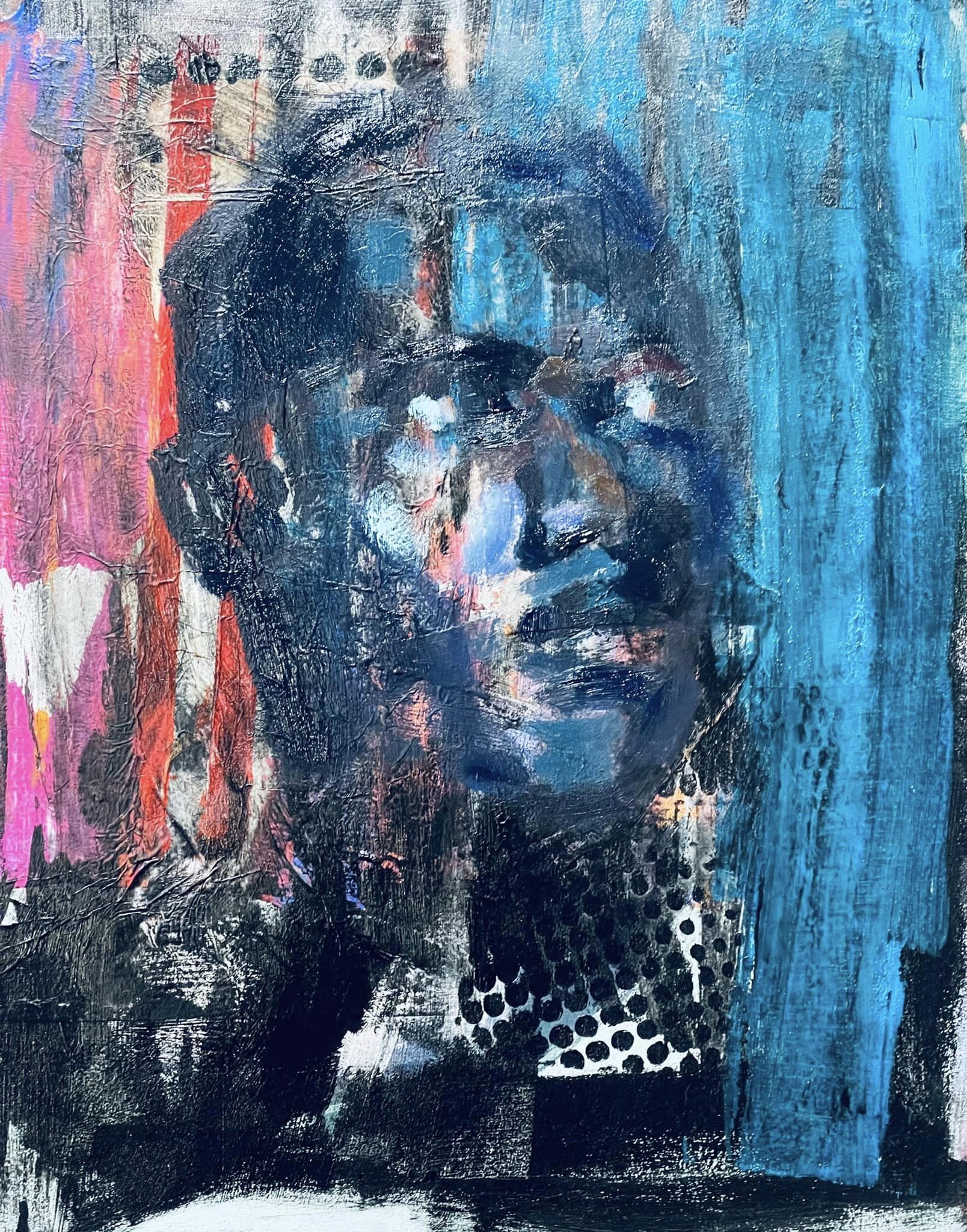
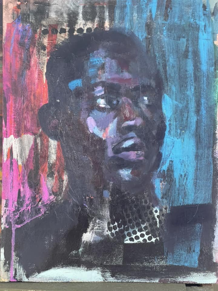
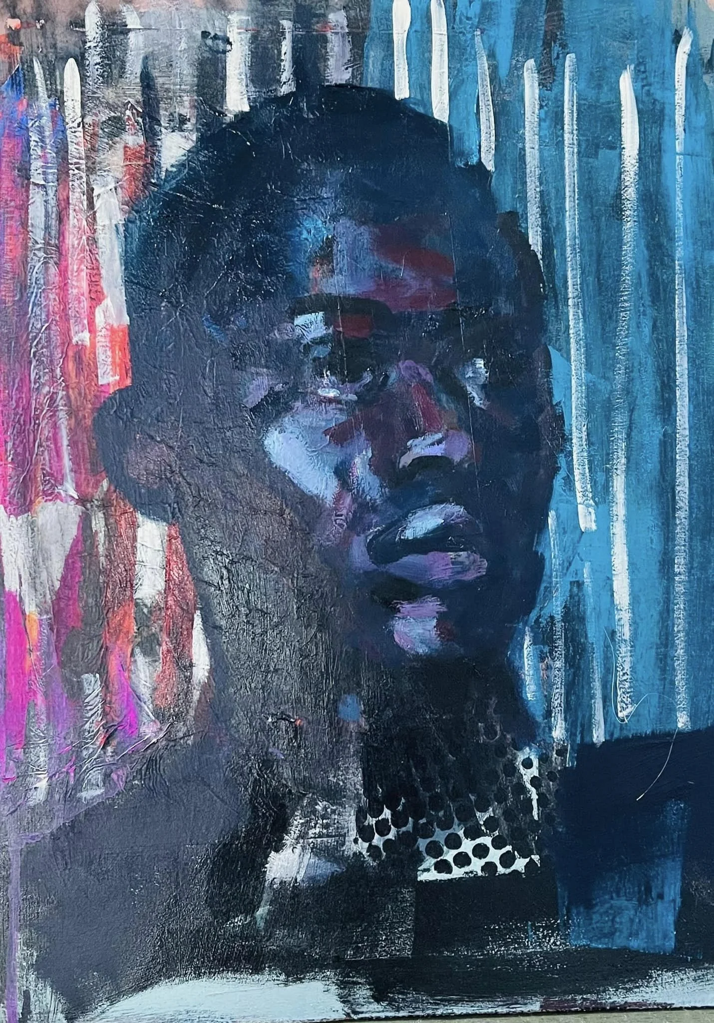
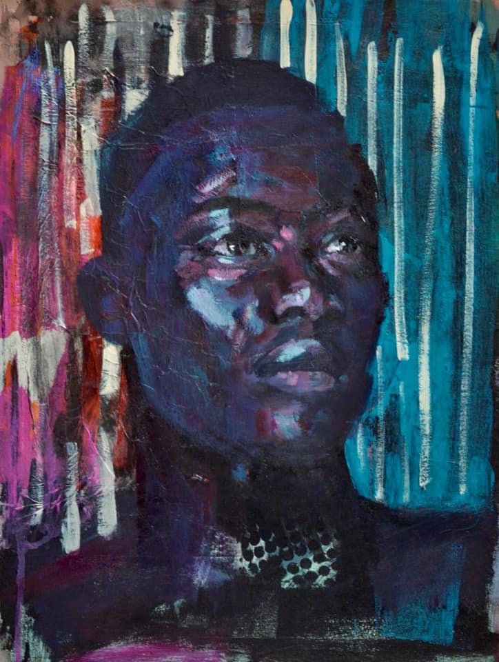
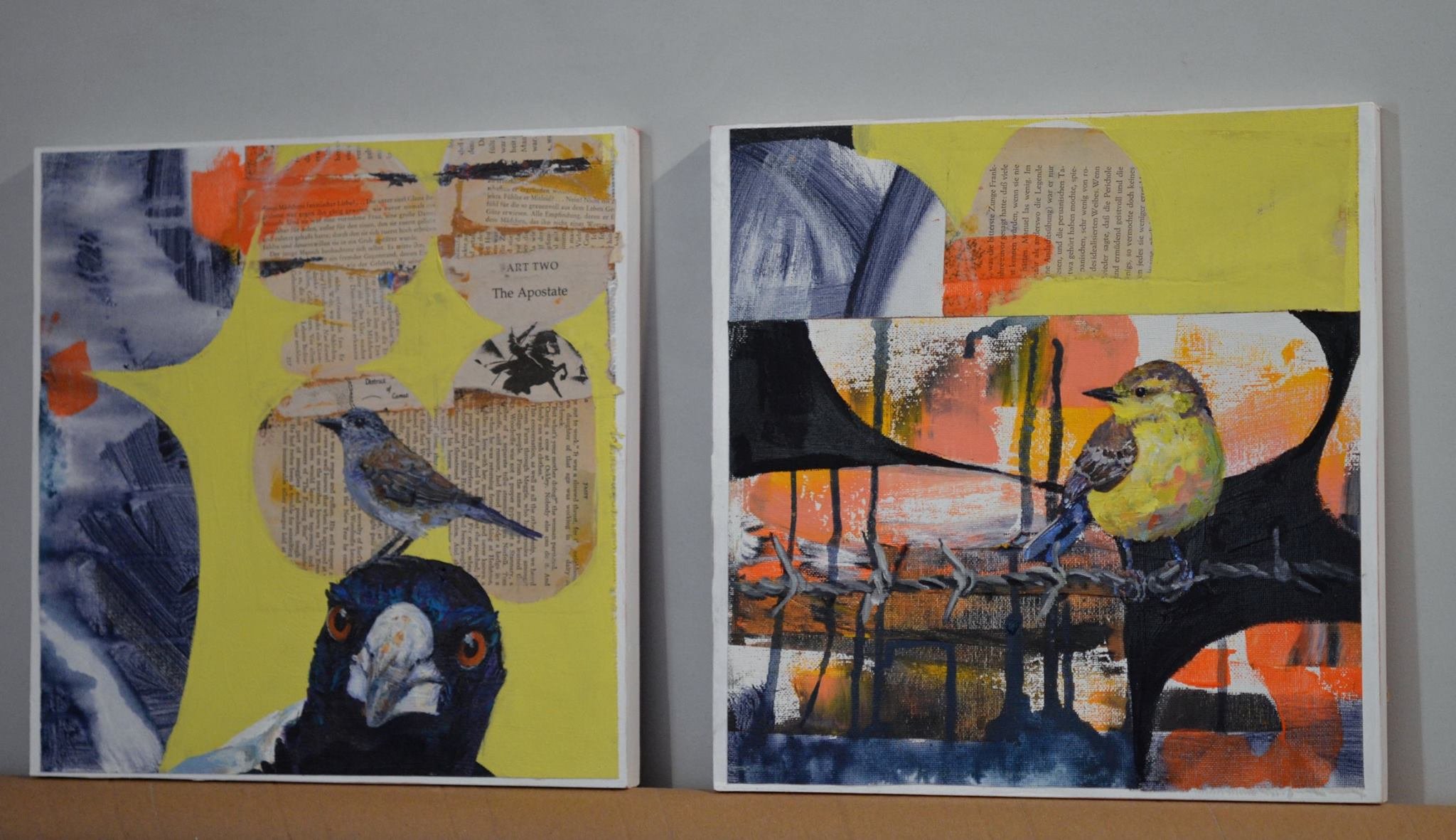
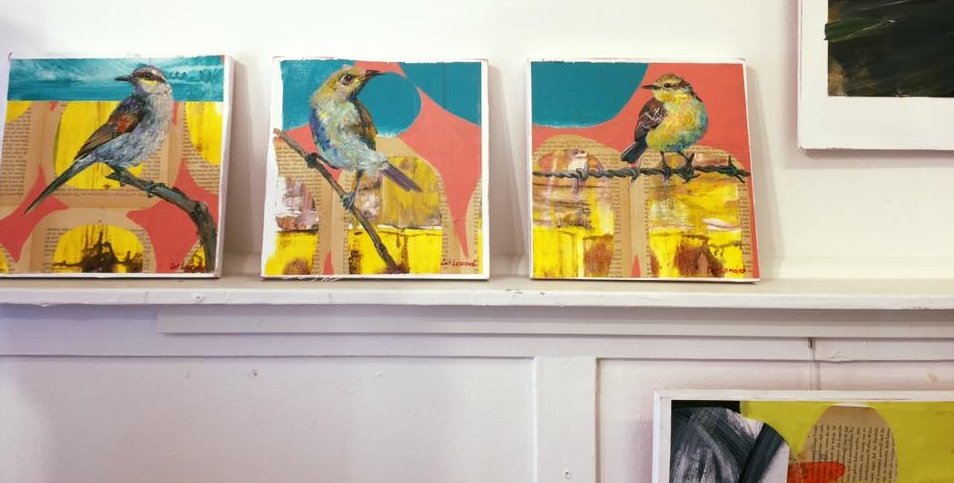
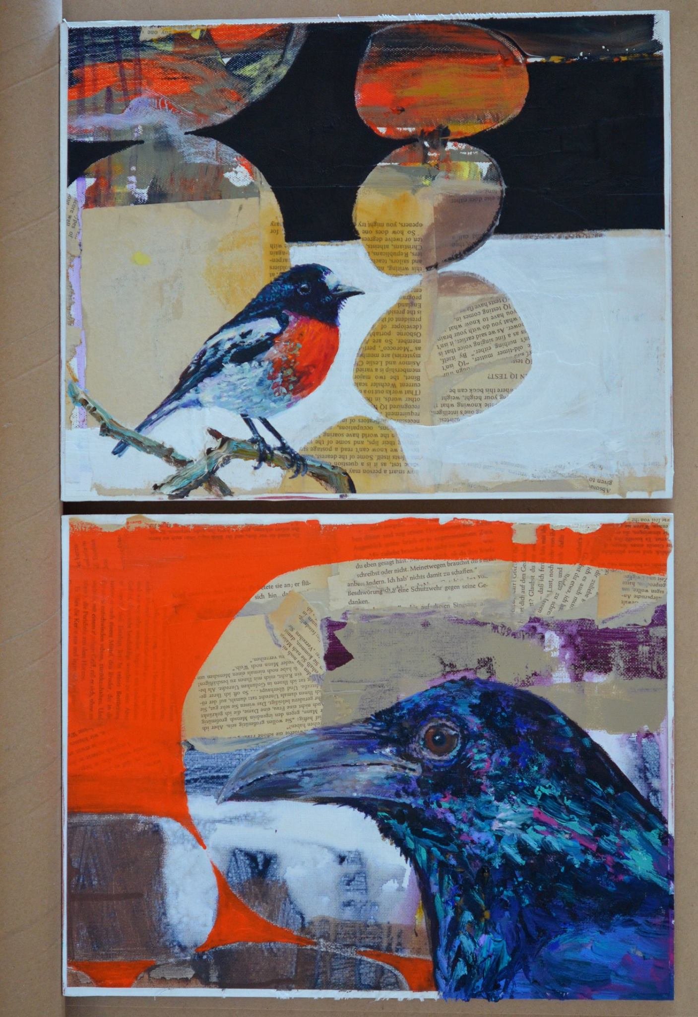
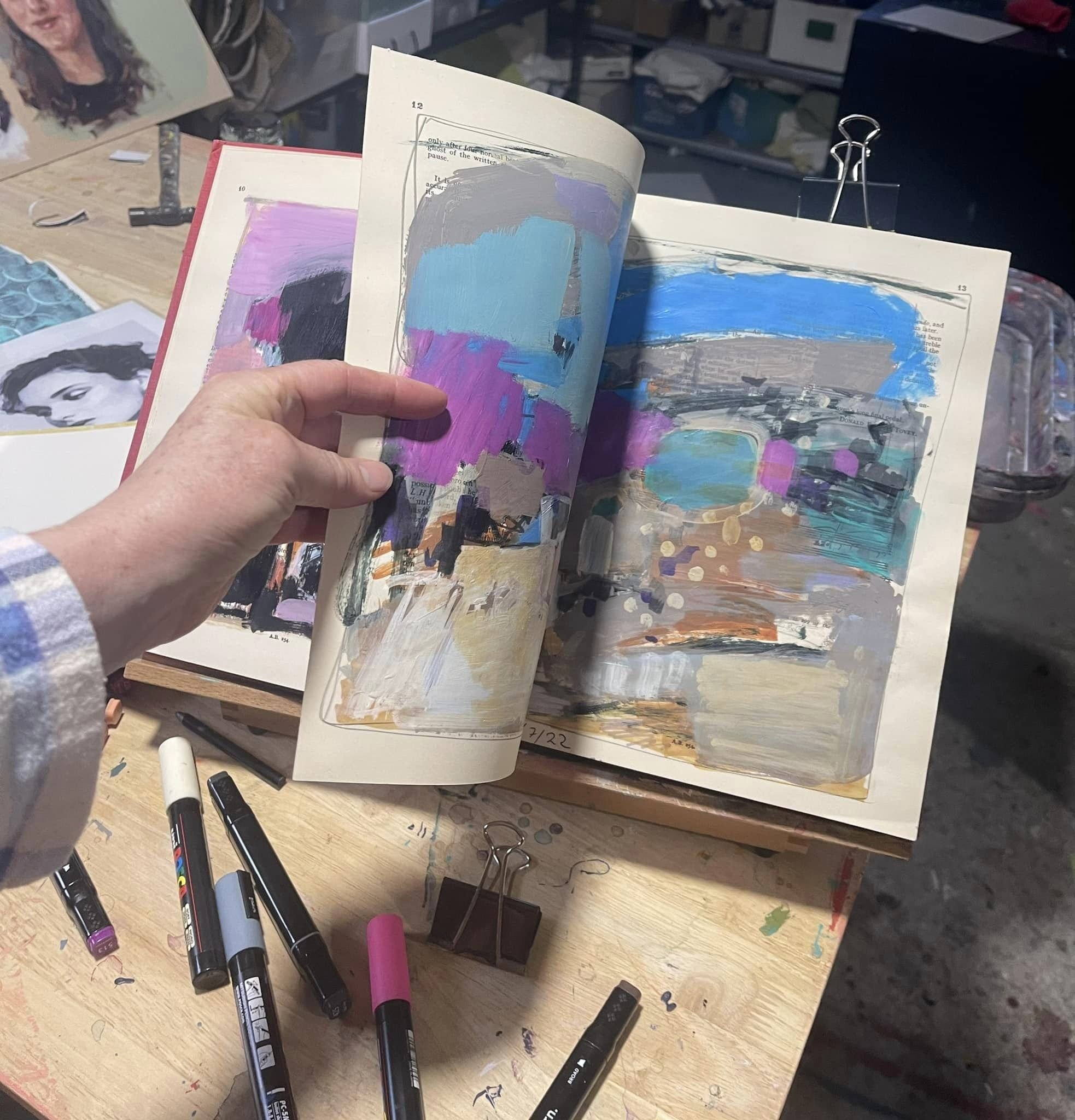
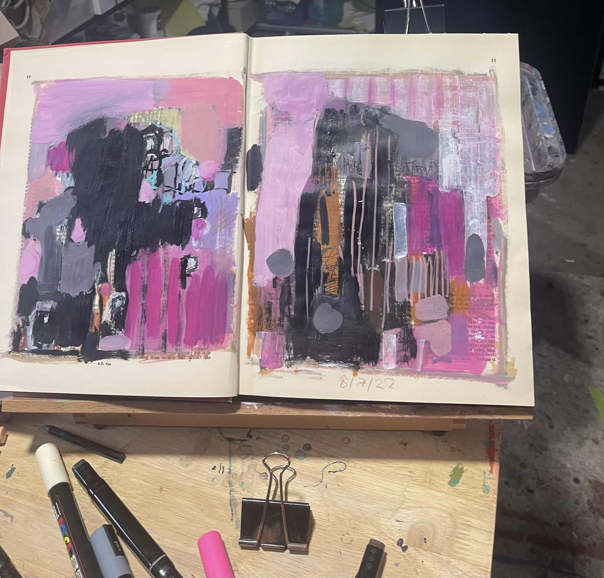
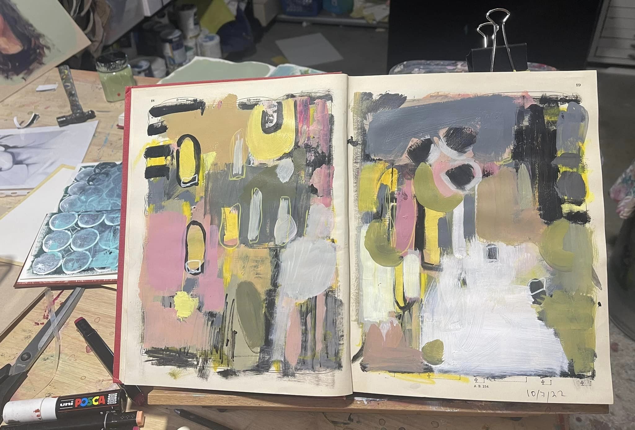
Why did I choose those colours?

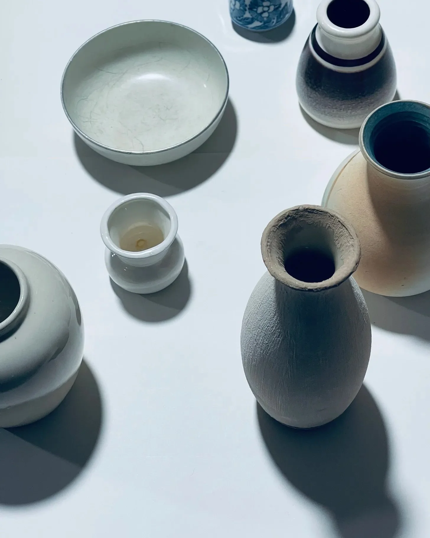
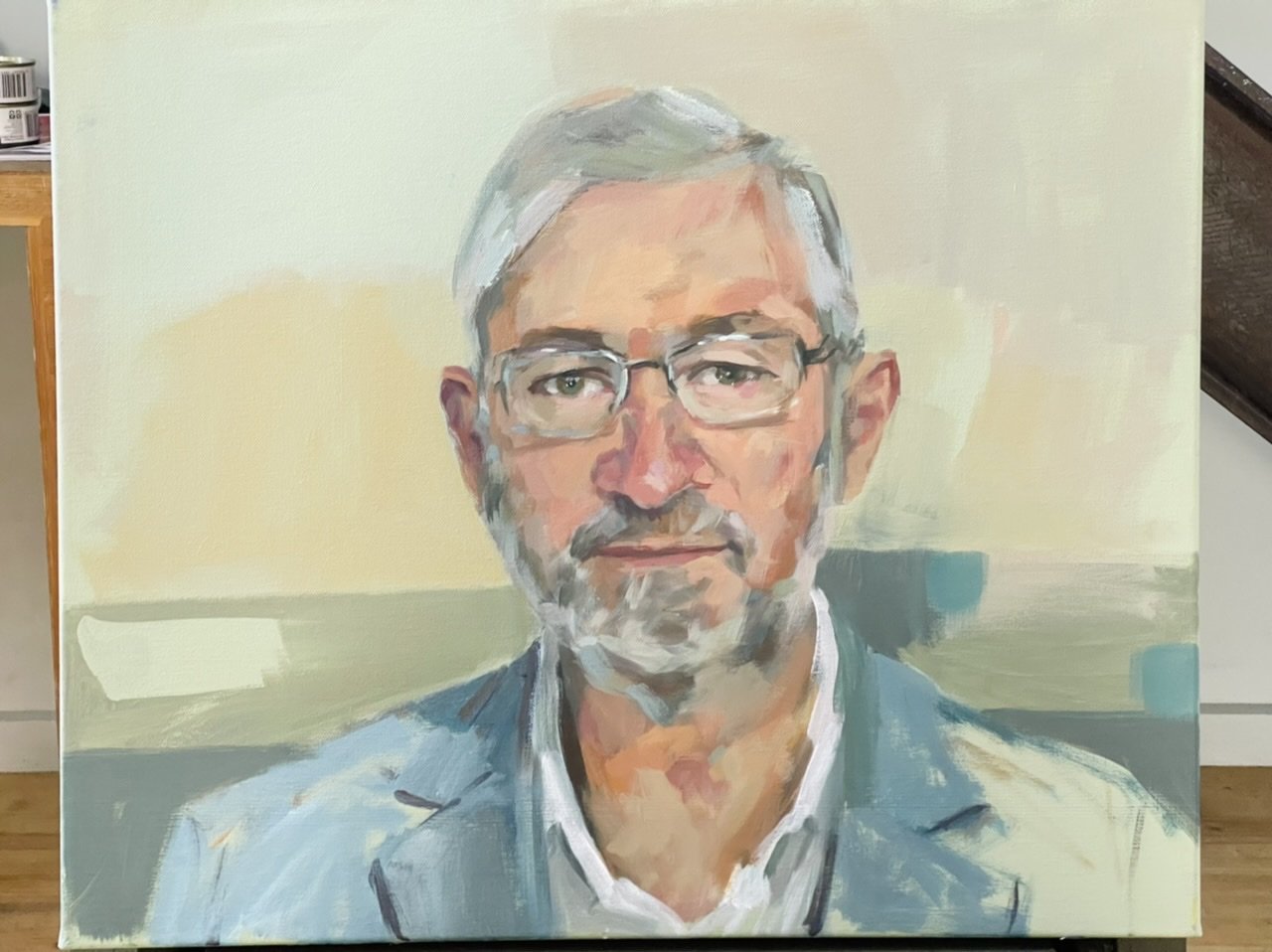
If I need to be able to explain why I chose the colours I did then I need to understand why, and here my own work becomes less experimental and more deliberate as I literally write down why I choose colours, pulling apart my own intuition, discovering for myself that colour is not a feeling but a formula. I knew it in my heart, just not in the Broca's area of my frontal lobe and Wernicke's area of the superior temporal gyrus part of my brain. It’s a win/win.

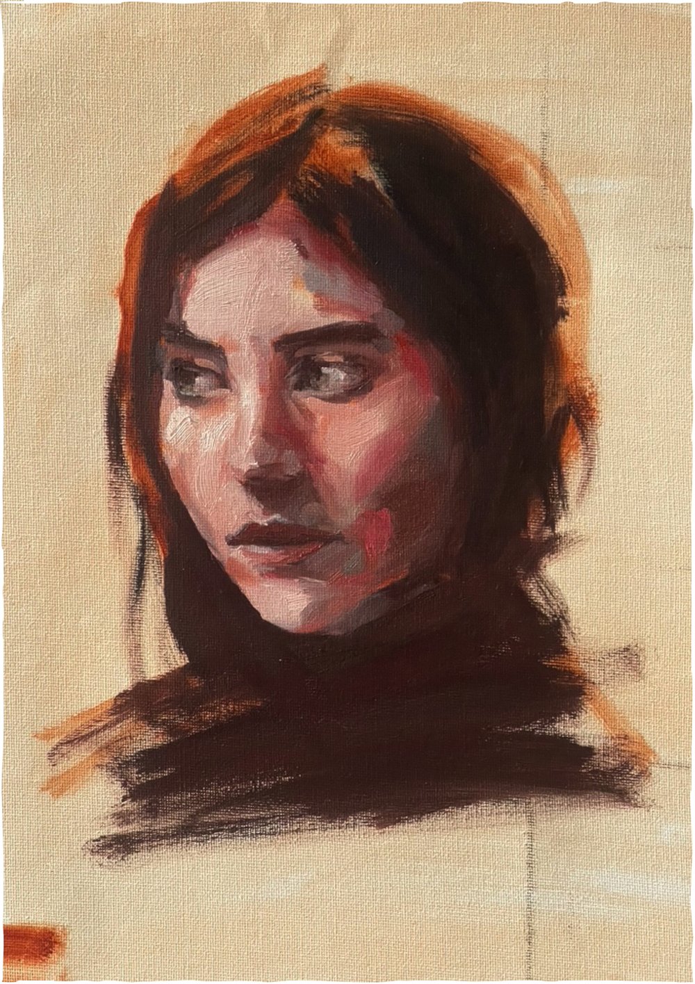
My most recent short course finished last Friday - a 2 week oil painting skin-tones course. I was very pleased with how efficiently the participants took to the method and worked with it, creating pleasing skin tones which was exactly what I was hoping for.

It was a lot of fun for me too, not only because the group was so lovely, and the most enjoyable company, but because I was well prepared which is something Krysh taught and re-enforced in my teaching method from the earliest of days. Preparation. Preparation. Preparation…. …and what’s most surprising about the preparation part is that right there, in the figuring out how I’m going to transfer this knowledge to others part, the most interesting discoveries are made and I find myself learning things too.

Art made FROM RecycliNG…

…materials is something I’ve dabbled in from time to time, and it’s something I greatly admire whenever I see it done by others. Sea creatures woven out of old nets and rope found washed up on the beaches. Horses made from driftwood, beautiful baskets woven from colourful plastic shopping bags. There should be more of it.

I try to include a little bit of recycling in my body of work, I should do more, I intend to do more. I did some today.

I’ve had an old frame (I seem to collect them , from the side of the road or op shops when I see suitable ones, or like when my sister gave me a box from a deceased estate auction she went to), I have a little pile of frames and boards here and a bit of a stack there… …and old books, I collect those too, for recycling/repurposing.

I can’t remember where I got the old frame from that I used today, but I love it. It reminds me of those gorgeous ornate frames in the art gallery. I adore those. I don’t frame my work usually, but I love those ornate gold frames. Sometimes it’s the frames, not the painting, in the galleries that makes my jaw drop.

At first I thought to mount a painting in it. I’ve got some completed work on loose canvas sheets in my art drawers, but when I pulled the frame apart I changed my mind and decided to paint straight onto the board. I like painting on board, and in this case it’s pre-cut to fit the frame perfectly and what I ended up with worked really well, I thought.

I didn’t have a plan, and it was a few months ago now that I pulled the frame apart - I tried a few different completed paintings on loose canvas sheet in it and I couldn’t decide on one so I started painting an abstract straight onto the board with left over paint…and then it sat there for a while with a weird abstract start.

Then, a few days ago I had more paint left over so I obliterated my abstract start with it and left that to dry, and then the next day I had more paint left over and that’s when I decided to paint the portrait I ended up fixing in the frame.

check the progress:

Another thing I like repurposing is books. I’ve used them in collage creations:

and I also love keeping them as books and re-writing them entirely, like this vintage stokers note book that has hand written notes and mathematical figuring out stuff in it. I repurposed it into Cupid’s little Black book that I work in when I’m feeling particularly poetic.

My latest book endeavour is a 1931 Beethoven’s sonata music book, gorgeous with a hard cover and the pages are silky smooth and surprisingly tough and wrinkle resistant when paint is plastered over them. This has become my expressive abstract enquiry book, and I work in it when I’m feeling particularly rebellious.

So I’m hoping this inspires you to do some repurposing stuff into art, so some of that stuff that is just lying around with no purpose and destined for landfill will have a purpose again.

Live portrait painting…

…in the public space is a very different experience than in a studio or painting from a photograph . A good studio setting can have fixed, flattering or dramatic lighting, and the light on the sitter doesn’t change. In a public space with daylight around the light constantly changes, is weak or strong or both if it’s a partly cloudy day, so it doesn’t matter how still the sitter sits because when the light shifts so do the shadows and highlights on the face causing everything to literally move - things look different depending on how the light hits it and because of this you’ve gotta paint fast.

The man who sat for me, Geoff, was excellent at sitting still. You can’t really talk while sitting still because everything moves when you talk which is something you just don’t notice untill you are painting someone or having to sit still. He had his own set of challenges in sitting still. He found a spot across the room to focus on and people kept walking in front of it trying to catch his eye. It wasn’t a warm day either and the chair wasn’t that comfortable and I kept interrupting him with questions.

My day began early, I had to be at the show by 10am and I planned to get there early to set up. There would be provisions to hang some work at the back of the stall we were allocated - two artists working each day in this stall right at the entrance of the Taste SA pavilion.

Painting outside of your own studio requires planning. What to take? Oils or acrylic paint? Canvas size? Will there be water to wash my gear? easel? (provided thank goodness!!) I’ll need to take my own water…How will I get there (train - they offered car parking with shuttle buss but that seemed harder than train)… could I manage a wet oil painting on a crowded train? No… The question really is “what can I manage to take and then bring home on chosen transport”. The weather forecast predicted rain.

Lucky for me I have this hardcore Mileaukee toolbox which is pretty sturdy so I carefully packed it with the minimum - paint, brushes, wet pallet, water for washing brushes, rags, a drink and snack, a sketchbook, some flyers, my tickets and food voucher and then onto that I strapped my canvas and some other suitable paintings to hang up in the stall which needed to be wrapped in plastic because of predicted rain.

When the train pulled up I noticed a big gap between the platform and the train. My gear being too heavy for me to lift I had a little panic - “oh how will get this on…?” As I stepped on backwards ready to heave it up in some kind of clean and jerk manoeuvre a nice young man in school uniform asked me if I “wanted help”?

“Yes please, Thankyou so much I really appreciate it.” He hoisted it up from the bottom handles while I pulled from the top and there I was on the train - now…something about a ticket and ticket machine…

Getting off was easier - I followed closely a family with kids as they made way to the exit through the crowd - there wasn’t a gap between door and platform either, because this Showgrounds platform was newly re-built, so it fitted the new electric trains perfectly.

Having been given an Exhibitors pass I went straight in before the gates even opened at 9am.

Making my way past the empty carnival part I thought this would be a good blog story so I took a pic 😊

After setting up I went for a bit of a wander to get my bearings.

Ready to start painting at 10am.

I asked Geoff a few questions before I started. I explained some of the ways I could compose this painting, took a few photos and cropped them to show him a few different compositions - like how much of him I could paint to fill the canvas and how much space for background I could have, and we agreed on the composition before I started.

We stopped for lunch after two hours of painting to resume again at 2pm.

Because I was going to finish this painting at home, I took some photos of Geoff where he was sitting that i could use as a reference to finish it at home, and after lunch I started working from the photo on my phone which helped me make some corrections, settle on an expression and better see some detail. After a further hour and a half Geoff had an early minute and I chatted to some people, and a friend who popped in and took a few more pics for me. Thanks Kathy 😊

I’ve got a few more hours to do at home but in my own space it’ll be a bit less stressful 😎

Photographing Paintings…

…is necessary when you intend to show them on social media. Posting your work on social media not only shows them to people, it’s also a great way to keep a record of your work. To archive it.

Facebook is particularly good for archiving work because you can create folders of paintings, put collections together in the folders and name them, and everything is dated. It’s then easy to search for a particular folder when you’re looking for something, and if you happen to be out and about and want to find a particular work, you don’t need your computer or hard drive, ,or to have alot of space filled with photos on your phone, but simply access to the internet on your own or someone else’s phone, go to photos on your site and find the folder which is listed under photos on your page.

It’s not hard to get a good enough photograph of your artwork for the purpose of posting on social media. You don’t need or want a large file format (like one that’s good enough to make a quality print) for social media because the sites down size them anyway. So unless you’re posting on a print-on-demand site like RedBubble, or sending an image that requires a 2+MB file for whatever reason, any ‘ol smartphone will take a great photo for this purpose with a few little tricks and tweaks.

The first and most important thing to do is turn off the flash. the flash will obliterate detail, and with the light bouncing off of the surface, completely change what the painting looks like.

Light is very important and the only light that works apart from very expensive studio lighting is daylight. Filtered daylight. So in the light of day but away from direct sunlight, that can be inside with the room lit up by windows allowing as much daylight in as possible, or on the shady side of the house outside, or under a verandah, etc. Cloudy days are my favourite.


I did a study last night to test a pallet I might use for my live painting at the Royal Adelaide show next week, so I thought I would compare the artificial light from a photo I took last night to the natural daylight from this morning.

above is the difference between daylight and regular artificial light that we use to light our homes - no filters or adjusting was used in these photos taken with my phone.

There’s a spot in our home that has light coming in from all directions including above, and that’s where I keep my “tidy easel” for photographing my work. If the sun is streaming in from one direction, nice and brightly, I turn my easel away from it to take the photo. If it’s a dim and dark cloudy morning or evening I turn my easel towards it. I’m avoiding shine which obscures detail and avoiding a kind of light that picks up too much detail on the surface like a speck of dust - the focus needs to go beyond the dust on the surface so a tiny tweak of a turn away from the light achieves this.

Set your phone/camera to its highest resolution. “Super Fine” or HD, high definition, or large, however it reads choose the largest setting (one that takes up the most memory space for a quality photograph. (Not live though).

Get as close to the painting as you can and square it up - so all sides of the painting sit as equally in the frame as possible. If the bottom edge of the painting is narrower than the top it’s not square.

an example of a squarely lined up and a not squarely lined up painting.

cropping

Once you have a good photograph it’s easy to crop on your phone with the editing setting, or you can crop as you upload to social media with whatever platform you’re using’s photo editing options. They all have them.


then of course you can style a scene, or take photos of your work to show them hanging - here you can be a bit more creative.

using the candy mock up app which allows me to upload photos of my art into a styled scene