A good way to understand a particular colour is to mix it with other colours and with white. Mixing a colour with other colours shows its strengths and weaknesses. A transparent colour does different things when mixed with another colour than what a similar opaque version of it does, as does a cool or warm version of the same colour, like different kinds of red.
Mixing a colour with white opens up the colour so you can see it more clearly. Dark colours, like midnight blue, Paynes grey and Dioxazine purple can all look the same when they are in little piles on your pallet, but a little bit of white mixed into each colour immediately shows how different they are from each other.
Below are two examples of almost the same colour pallet, but I’ve used a different red.
In the first painting (pear) I’ve used light red ochre which is opaque, Aqua green light which is opaque and pastel, transparent Indian yellow and white.
In the second painting I changed the red ochre to transparent Magenta and the other colours are the same.

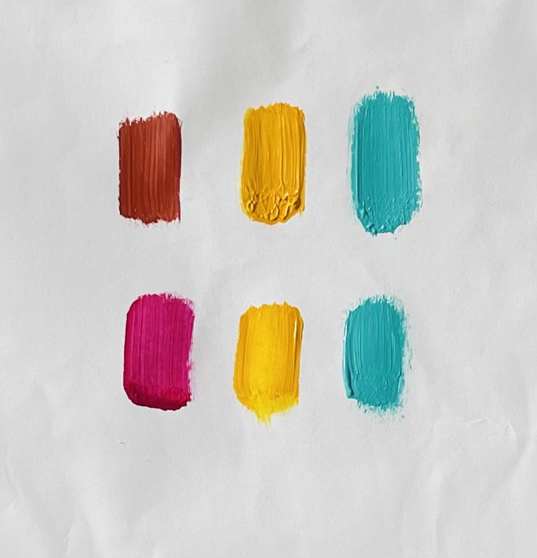
light Red Ochre vs Transparent Magenta
the earthy colour of the red ochre is warm and brownish compared to the vibrant cool, transparent magenta, and the green is pastel which didn’t allow me to mix a strong dark so I needed to adjust all my other tones to create the illusion of a strong dark.