…in painting that make the process more enjoyable when observed - like starting with the dark tones and slowly introducing the lighter tones as the painting progresses. In oil painting this rule is a good rule to follow, but this rule doesn’t really apply to acrylic painting because of the fast drying nature of acrylic paint.
It’s absolutely fine (as far as i’m concerned) to start an acrylic painting with the lightest value and work all over from the value scale as randomly as possible.
Oils on the other hand…
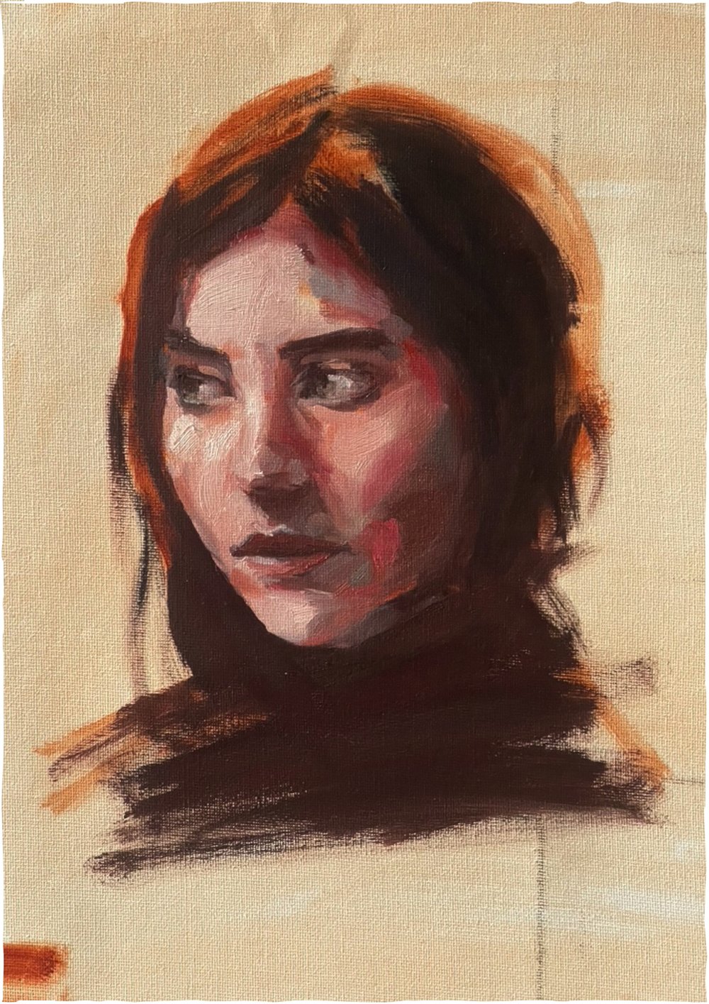
I hadn’t touched my oils for a while so I thought I’d do a couple of studies using similar limited pallets to the acrylic studies I’ve been doing of late, (3 colour studies with a mid tone being my darkest tone) and I found myself introducing the light tones early on in the painting process, right at the start, breaking the rule of dark tones to light… I kind of went… mid tone…light…mid…light…(“help I need to add an extra dark option”, added 1 more colour to my pallet - raw umber in this case)… dark…detail.
Cad yellow was used in both studies, with permanent rose and manganese blue hue in one of them, and cad red and cerulean blue in the other. At the very end of each painting I needed a dark tweak - burnt umber to the first and prussian blue to the second - three colours per painting + white + a tweak, and I blame the overpowering nature of the cad yellow for needing this tweak. Both paintings were alla prima - they were painted from start to finish in one sitting, not allowing the paint to dry in-between stages.
The next oil study I’m going to do I will try a classic complex pallet.
This will be something like:
Viridian green, Alizarin Crimson, Transparent red oxide, burnt sienna, Cad red deep, Cad red light, yellow ochre, titanium white, cerulean blue, ultramarine blue and ivory black. (I googled it)
Note the yellow in the above example of a classic pallet, there’s just the one which is not a strong yellow at all, and the next closest thing to yellow in this pallet is the green which is pretty dark.
I plan to post the study with the classic pallet next week…
stay tuned.
oil studies,
1/ daughter in Cad yellow, Permanent Rose, Manganese Blue Hue + white + Burnt Umber
2/ study in Cad Yellow, Cad Red, Cerulean blue, + white + Prussian Blue
see my struggle with the limited oil pallet on youtube:
the struggles are real…