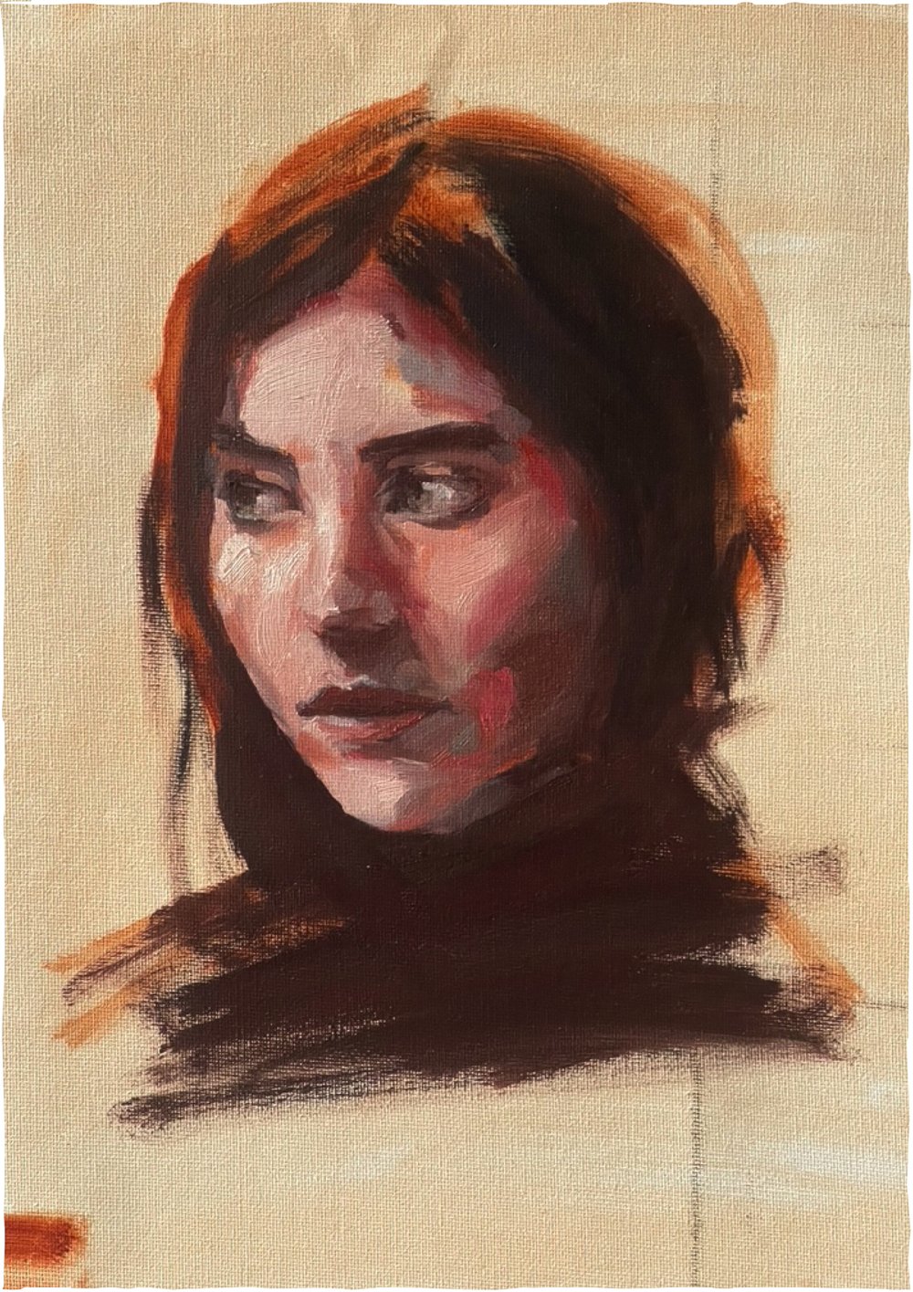
..is something I want to explore more thoroughly during 2024.
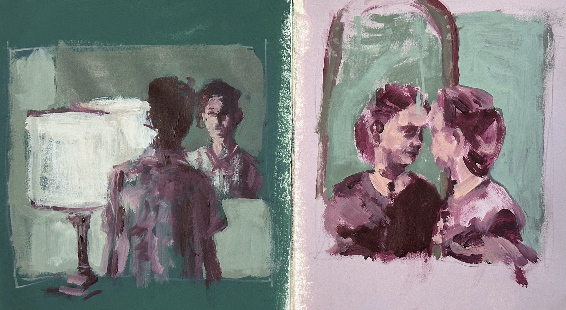
I’ve been playing around with weird colour combinations in my paintings - These weird colour pallets I happen across by chance through the painting process. I’ll choose a colour to draw out my design, then choose a lighter or darker tone to add some detail - be that depth or highlights, as part of the initial drawing stage of a painting. This additional second colour is chosen for it’s tone not it’s colour and it’s after I’ve painted with it that I observe what the colours actually feel like together - both how they sit next to each other and the colours they make when mixed together.
it’s not always pretty…
First I painted the green and pink grounds without knowing what I was going to do with it. When I was ready to do my studies I grabbed a dark tone (burgundy) and a light tone (light pink) to draw with, then chose the light green to isolate the subject. The pallet resolved itself during the process and now I have a weird colour pallet that I can use again without a thought, and add more colours to in a larger work.
Colours can change the feeling of a painting - sometimes just layering colours on top of colours helps me find a solution. I choose a colour for it’s tone and warmth or coolness rather than it’s colour, to see if it works but I don’t really care if it doesn’t work well because the layers add so much depth and interest that it’s worth the experiment if I do choose to paint a different colour over the top.
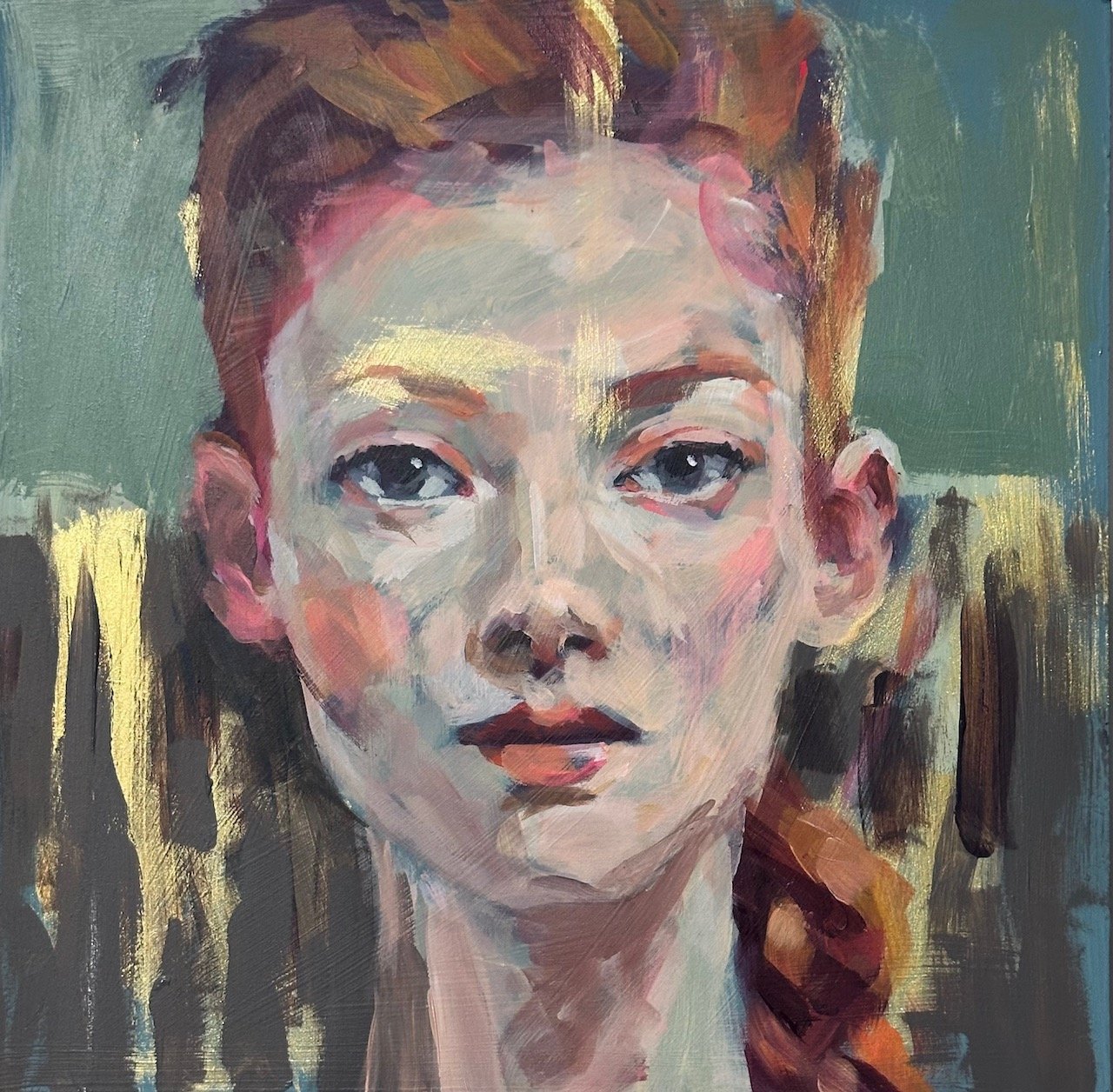
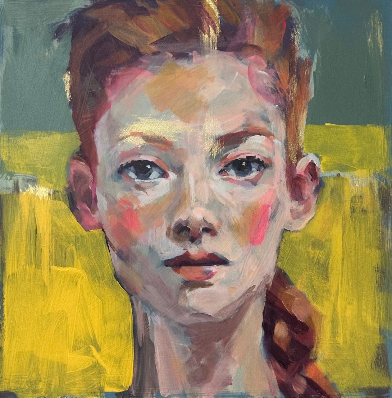
Below is a head I’m working on - on the left it’s feeling drab and messy so I know I need to make a drastic change to the background. I grab a tub of straw yellow gesso and block out the drab.
Why straw yellow? I guess it sort of jumped out at me when I looked through my pile of paint. I’ve used it before in a background so I know it’s a workable background kind of yellow… …so having put some down I don’t mind the yellow even though it needs refining, So now I’ll continue with the face.
Working on the face I’m using the pallet I started with, not adding any of the straw yellow, I will keep that seperate. This creates a “pop” factor rather than a harmony thing. Sometimes I like harmony and will limit the pallet to get that and mix all the colours together to make all the tones, both in the background and in the subject.
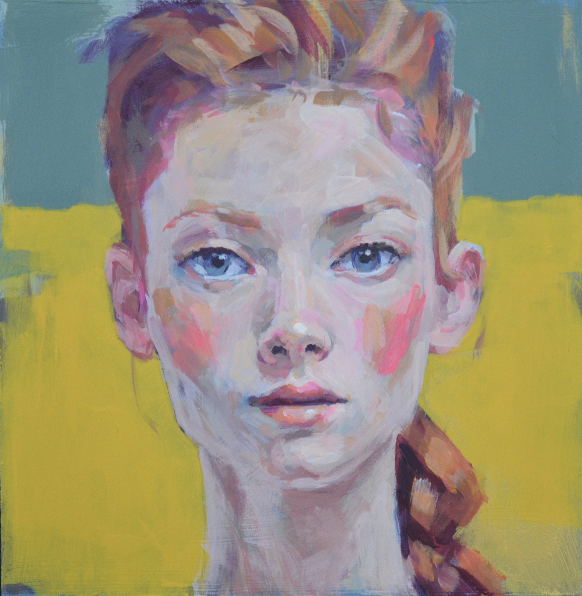
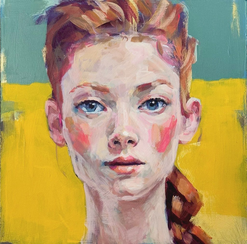
finishing… this little portrait was a matter of refining what I’ve already got and adding more layers of the same to add depth and to neaten it up so that the general visual effect isn’t messy and chaotic, but there’s still messy marks to be seen as you look more closely at the work. A sweet spot between chaos and order kind-of-thing.
Another thing Ii want to look at again is the difference between photographing my work with my phone camera and my Nikon DSLR. I’ve noticed the Nikon makes a much softer photo while still showing the detail, where my phone exaggerates everything. The Nikon shows the painting more accurately to how my eyes see it in real life at a normal viewing distance, and the phone shows it as if I was looking at it really close, like a nose distance away, with strong light so is better for viewing on a phone and in thumbnail situations, where the Nikon is better for viewing on a large screen and making printed copies I guess.
check it out - Nikon 59mm macro lens on the left, phone camera macro setting on the right.
