Viridian green...

…is a colour I’ve had in my oil kit from the very beginning, but it’s not a colour that I’ve used much and it’s certainly not a colour that I would normally add to my skin tone pallet…however, I’ve noticed that other artists that I admire do include Viridian green into their complex skin pallets (by complex I mean more than 4 colours + white), and so I think it’s about time that I tried it for myself.

so…

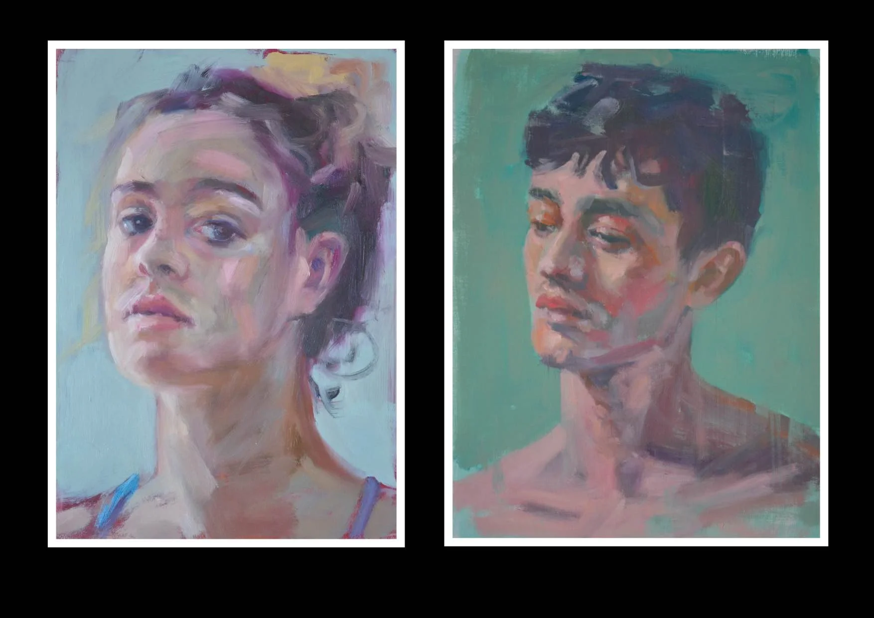
I set out the complex pallet that I said I would try in a previous blog and painted an alla prima portrait right off the bat. I was pleasantly surprised at the addition of viridian green, and I’m itching to use it again.

colours used for this oil painting study are, Viridian green, Ultramarine blue, Cerulean blue, transparent red oxide, Cad red, Cad red deep, Alizarin crimson, yellow ochre, titanium white and ivory black.

note: if you want to watch the process on youtube see here

The trick to using Viridian green in skin tones is to mix it with the reds to get skin colours, so instead of adding blue or black and yellow, you use the green as the main mixing colour into the reds, and then tweak it with the other colours, not the other way around. It’s just works so nicely, like it’s the perfect mix of blue and yellow for this job I think.

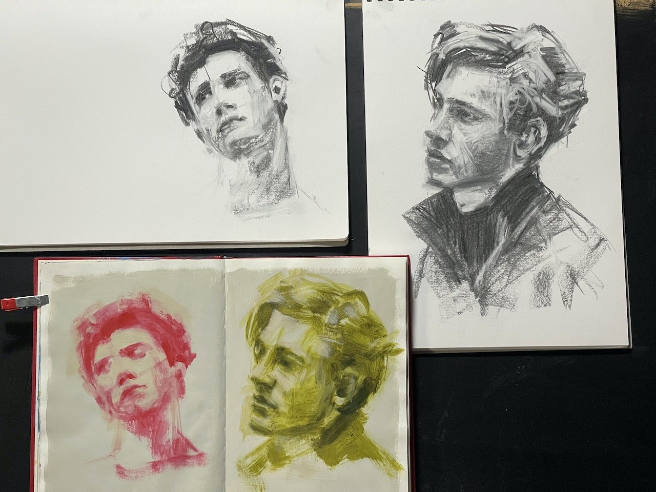
I put out so much paint…

…on my pallet there’s enough left to do another portrait, so I’m going to try something else that I’m not really comfortable doing - finishing a portrait that I started in acrylics with oils, and I’m going to use this complex pallet.

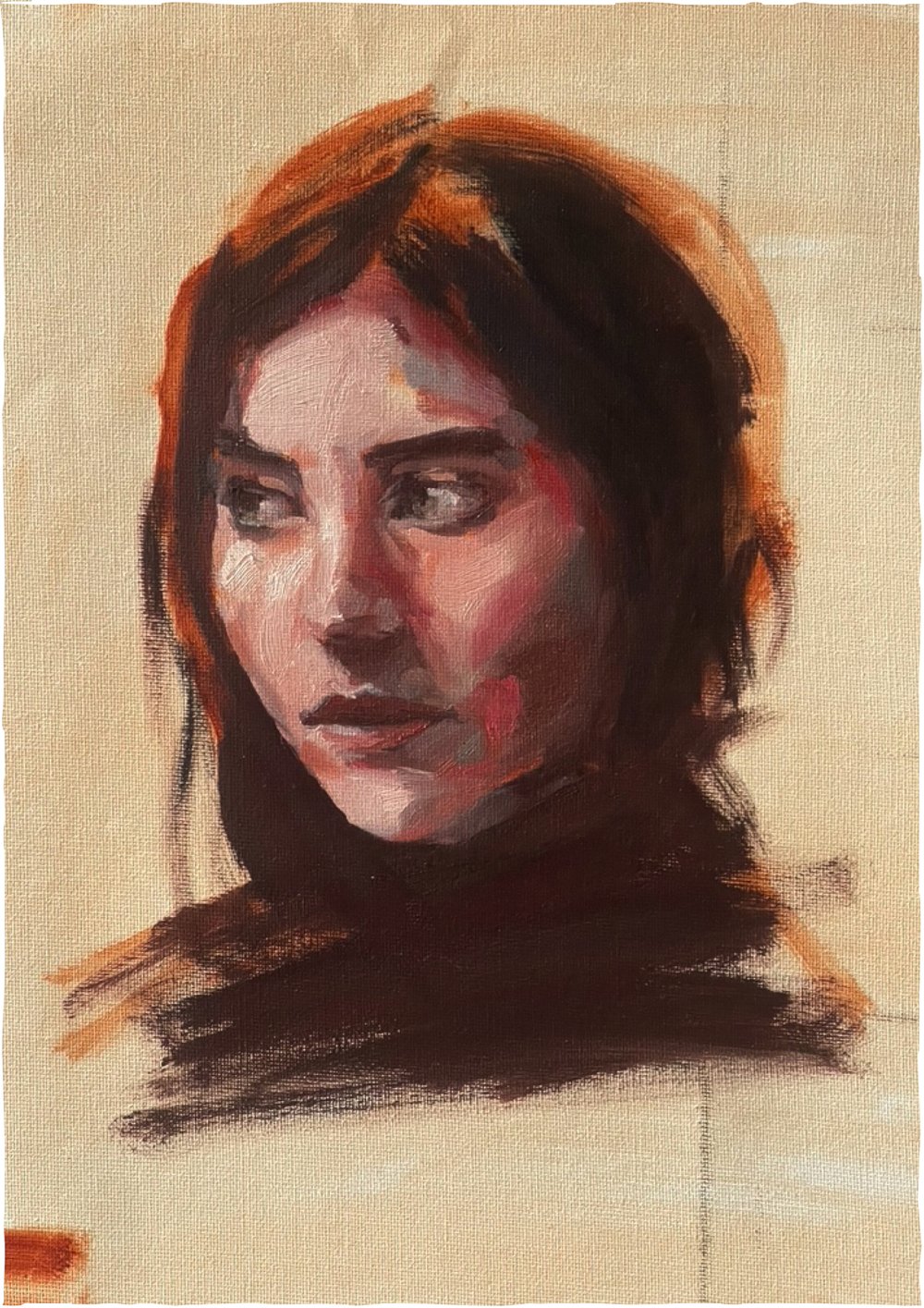
I painted this acrylic study…

…earlier this year. I used a limited pallet, 3 colours + white and left it looking unfinished.

It has now been transformed with the oils, and although the process was frustrating (like I prefer to start in oils if I’m going to use them), I’m happy with the results (see below).

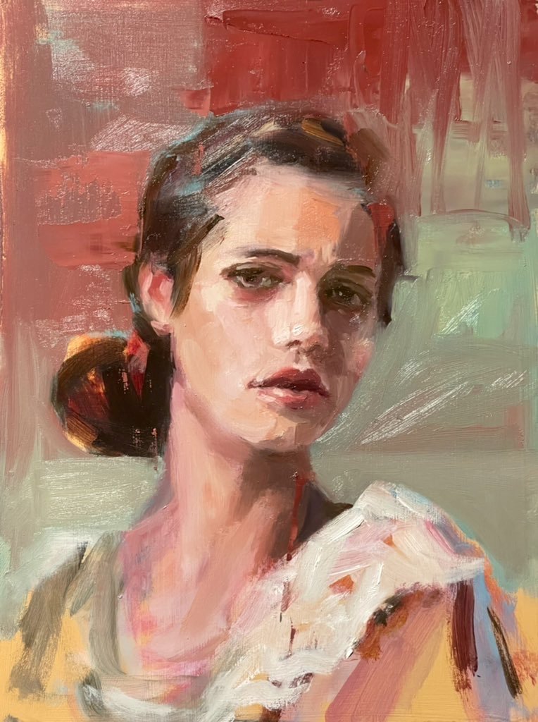
oil study over acrylic underpainting using the complex pallet with viridian green.

I have one more idea to try before I close this blog…a limited pallet using viridian green, red and white. I’m dubious that I’ll pull this off without adding yellow ochre to my pallet but we will see…

with the addition of yellow ochre, viridian green and red + white make a workable skin pallet.

well…after these studies I am moving viridian green from the pile of paint that I don’t bother with to my pile of necessary colours and favourites.

Fancy that!


Zinc White...

is a transparent white, which is kind of weird because white is not a colour normally used like other transparent colours are used….technically white is not a colour and is used to tint other colours when mixed with them. Zinc white has one tenth of the tinting strength that titanium white does.

so how should it be used…

…time for a bit of play, and as i’m writing this I’m thinking of a way in which I can experiment with zinc white.

My first experiment was a bit of a fail - trying to use zinc white like I normally would use white, mixing it with three primary colours to paint an eye - I ended up getting frustrated and having to add white gesso to add enough strength to the paint for the light tones because the zinc white is so subtle that it’s almost like using a water colour. (there is no watercolour white paint, btw, as the white paint that you get in watercolour sets is actually paint not watercolour. I gave up before I finished.

Then I thought I’d compare zinc with titanium as mixes and on a dark ground.

zinc study 1

the way I paint, zinc white is too transparent to be the only white to use on skin. The thin nature of the zinc pigment is more obvious when painted over another colour.

zinc study 2

comparing zinc with titanium white, mixing them both with red and then seeing how it looks on a dark ground

now I need to think of another experiment…

….also I’m writing this blog as I try the experiments, which is an experiment in itself too :) I feel like a bit of a scientist.

I’ll try it on a bit of fruit…and maybe another eye…

Zinc study 3

It feels moody on a dark background (or is that me ‘cause I’m struggling). A softer brush lays the paint down better than a corse one. It works nicely with layers - light over light to bring it up to lighter tones. I like how you can see the light layers which you normally don’t when using opaque paint unless you add medium. It’s kind of like using a tinted medium really. None of this is really surprising except that it’s white doing these things - like it’s just not how I’ve ever used white before but I see the potential…

Just from these little experiments I understand zinc white alot better. It will be useful when I want gentle shifts of tone at the end stages of an acrylic painting rather than battling with getting the colour match using titanium, or thinning it with lots of medium. It would also be good for opening up dark colours like blue without obviously tinting them, I think.

Zinc study 4

Here I'm comparing the tinting strength of titanium white to zinc white in midnight blue paint. I really notice a lovely effect happening around the mid tones, the zinc makes a cleaner colour that doesn’t look as pastel as it would when adding titanium white, and it’s so much easier to make subtle changes of tone.

The best thing I can do to really get a feel for it and see if I like it is to simply put it on my pallet along with titanium when I’m painting and see how I go, and if I do this for a few months it may become a necessary part of my painting process. We shall see.

note: all experiments were done in acrylic paint.

What should I paint next?

…is a question that I sometimes ask because there’s a million things I could, and want to paint next, and it’s hard to decide. In fact, the choice is so overwhelming that the question is always about making a choice rather than coming up with a new and innovative idea.

Interestingly, it’s not much of a problem if I get an answer that I don’t like because the painting process is the fun part and it’s just a matter of making the subject fit the process.

It’s lovely to paint things that mean something to you as these make memories - painting things like gifts, flowers that people give you, vases that belonged to your grand parents, portraits of people that you know, pets, fruit off of your dad’s tree, the cup of tea you forgot to drink, a lovely pear with the leaf still attached that you’ll eat after, a corner of the lounge room, the view from the bedroom window, your own hand, a poem that you wrote (painted conceptually that is), the letterbox or something out of the garden, a bunch of lavender in a hand thrown ceramic pot you got for your 21st from an old friend.

What would happen if I asked “How should I paint my next painting?”

hmmmm….

I guess the “how” bit is about skill and mastery of materials, to use them in different ways to create the required effect, or to use materials that I don’t use alot, like oil pastels and watercolours, or paint something super smooth with no visible brush marks…that seems to me that it could be a bit more difficult to fulfil.

Paint things that people give you

I got a bunch of proteas from the lovely Mareka and so I painted one.

Paint things to create memories of them

Pat got this little succulent for her 16th birthday from her friend.

there are rules...

…in painting that make the process more enjoyable when observed - like starting with the dark tones and slowly introducing the lighter tones as the painting progresses. In oil painting this rule is a good rule to follow, but this rule doesn’t really apply to acrylic painting because of the fast drying nature of acrylic paint.

It’s absolutely fine (as far as i’m concerned) to start an acrylic painting with the lightest value and work all over from the value scale as randomly as possible.

Oils on the other hand…

I hadn’t touched my oils for a while so I thought I’d do a couple of studies using similar limited pallets to the acrylic studies I’ve been doing of late, (3 colour studies with a mid tone being my darkest tone) and I found myself introducing the light tones early on in the painting process, right at the start, breaking the rule of dark tones to light… I kind of went… mid tone…light…mid…light…(“help I need to add an extra dark option”, added 1 more colour to my pallet - raw umber in this case)… dark…detail.

Cad yellow was used in both studies, with permanent rose and manganese blue hue in one of them, and cad red and cerulean blue in the other. At the very end of each painting I needed a dark tweak - burnt umber to the first and prussian blue to the second - three colours per painting + white + a tweak, and I blame the overpowering nature of the cad yellow for needing this tweak. Both paintings were alla prima - they were painted from start to finish in one sitting, not allowing the paint to dry in-between stages.

The next oil study I’m going to do I will try a classic complex pallet.

This will be something like:

Viridian green, Alizarin Crimson, Transparent red oxide, burnt sienna, Cad red deep, Cad red light, yellow ochre, titanium white, cerulean blue, ultramarine blue and ivory black. (I googled it)

Note the yellow in the above example of a classic pallet, there’s just the one which is not a strong yellow at all, and the next closest thing to yellow in this pallet is the green which is pretty dark.

I plan to post the study with the classic pallet next week…

stay tuned.

oil studies,

1/ daughter in Cad yellow, Permanent Rose, Manganese Blue Hue + white + Burnt Umber

2/ study in Cad Yellow, Cad Red, Cerulean blue, + white + Prussian Blue

see my struggle with the limited oil pallet on youtube:

the struggles are real…

Indian Yellow...

…has been around for-like-ever, but is a colour that I’ve only recently started using myself.

Even though I put it in the “dirty yellow” box along with yellow ochre, Naples yellow and raw sienna, Indian yellow is clean and bright by comparison and this is because it’s transparent. I guess it’s in the dirty yellow pile because it has an orange/brown quality to it.

Indian yellow was first used in 15th century India. It was made from the urine of cows fed on mango leaves which contain a toxin called urushiol. The cows became very unhealthy with this diet but their urine produced the precious pigment which was dried to a powder and the powder was formed into balls of yellow pigment which was shipped around the world while it’s source remained a mystery. No one knew what it was made from until 1880something.

It was around the time of the discovery of how the yellow was made (Sir Joseph Hooker’s work), that the pigment disappeared off the market…something about animal cruelty…there’s not much of a record about this except his letter of enquiry to the Indian Department of Revenue and Agriculture.

Luckily for me, and every other artist who loves the colour and loves cows, Indian yellow is now a synthetic replication of the original pigment.

The thing I love about Indian yellow is how it mixes with other colours. It’s not a yellow I would use without mixing it with some other colour - like I’ve tried it as a colour by itself in a background and it doesn’t work for me on it’s own, it’s not beautiful on it’s own but boy oh boy does it mix well with other colours. It makes gorgeous oranges when mixed with reds and pinks, it makes wonderful greens when mixed with blue and other greens and that’s why I love it so much.

playing around with Indian yellow

Indian yellow study of daughter no. 2


art study...

…is playing around with different concepts, ideas and materials in preparation for something larger.

It’s play really, well…the kind of art-studying I’ve been doing this last week feels, to me, like play.

I must be learning something… I’m trying things that I haven’t tried before, but it seems more like I’m confirming things that I assume will happen because I’ve kind-of done something sort-of-like-it before, or I’ve seen something maybe done in a similar way somewhere, but haven’t put it to the test for myself.

Every study is somewhat different from the one preceding it, but similar enough to guarantee some degree of success, and success is enjoyable - so there’s the repetition and the pleasure of knowing there will likely be success and that is what makes it more like play, I think.

“Play is the work of children” - so I figure that in order to make it age appropriate work I’ll sum it all up with the writing of this weekly blog which feels more like work than the art studies do, but is more like play than the art studies are.

One thing I’ve learnt from writing these blogs is to save what I write as I go. There’s no pleasure at all in accidentally deleting a well thought out paragraph or two because you didn’t have the foresight to save them before the phone rings and you close the page in a multitasking fluster… …and my “ iCloud storage” has been “full” for at least 5 years.

Art studies are suppose to solve problems in preparation for the finished work.

One thing I’ve learnt from problem solving with art studies is that I need some problems to solve…

…and that got me thinking…

…maybe it’s the creating of new and interesting problems, and not just the solving of them, that makes art study different than play.


White paint...

…makes grey paint when you mix it with various browns. You don’t need black to make grey.
White paint lightens colours to make pastels, it can also intensify the colour when used sparingly but when used liberally it desaturates the colour. It makes colours dull as it lightens them - so what should be brighter tones will loose vibrancy and appear dull as the opaque pigment replaces colour with tint to make lighter but less brighter tones.

It’s a bit of a paradox using white.

The most common whites are opaque.
Antique white is warm and creamy, I use that as well as titanium which is cooler and usually pretty strong because it’s opaque, and unbleached titanium (which is kind of beige), not really white, but certainly light.

There’s zinc white which I believe is meant to be transparent, I have a tube in oils but I haven’t studied it yet. Apparently it’s good for keeping colours vibrant when lightening them because of its cool transparency. I’ll do a study on zinc white soon out of curiosity. (Mental note…I’ll write it in my diary later).

There’s led white too which is warm, opaque and extremely toxic. Titanium has replaced led as the most used white because of its toxicity. I’ve never used led white myself, probably never will even though it was the favourite white of many great painting masters and is meant to be lovely…

White is a colour in nature but in paint it’s the absence of colour meaning you can’t mix the colour white, rather the paint is made without adding colour but taking it away (think unbleached titanium).

So the rule of thumb in painting is to use white sparingly…unless, ofcourse, you want to use it liberally to make the work all about white, which is what I’ve attempted to do with this pot and blog.

colour pallet using Indian yellow, magenta pink and Prussian blue, + lots of white

What should I paint next?..

I have a list about a mile long of things I want to paint and of things I need to paint that will bring me up to speed with requests, commissions and various projects I’ve expressed interest in. They are all exciting and I want to attend to them all at once. It is impossible to do them all at once, of course.

To resolve this fortunate problem I allocate time for the work that I need to do, and for the work that I want to do, during the days that I paint (most days).

I’ve talked about my commission work in a previous blog - I set time aside early in the morning for that…usually before breakfast. I’m working on a commission right now in-between writing these sentences for this blog. It’s a nearly finished little animal portrait, and to complete it I am doing a series of little touchups and corrective tweaks, and after each set of these thoughtful brush marks I turn away from the painting, write a sentence here then turn back to it with “fresh eyes”, and this helps me from over working the painting and losing some of the spontaneity of the first marks of paint…(that’s what I tell myself, anyway)…

You see it takes time to finish paintings…time spent thinking about it not actually painting it, and sometimes this can feel like procrastinating…(come to think of it maybe that’s exactly what it is), so it’s helpful to have some other simple tasks to do in-between each set of tweaks, like housework, checking emails, bookwork, blogging…starting a new painting….except the problem with starting a new painting is that you can get so caught up in it that before you know it you’ve got two paintings that need finishing…or three…or twenty paintings that need finishing.

It’s important to finish paintings - by finish I mean as finished as they can possibly be kind-of-finished. That means signed, dated, ready to hang, photographed and shipped kind-of-finished.

For me it works best to spend time finishing paintings in the mornings, a hour minimum each morning so that I can feel like I’ve worked productively, done what i’m suppose to do and then be free to explore or start something new later in the day, something fun, or a thing I’m curious about or have been meaning to try, or a study or a request…

…which may very well end up on the morning pile, needing to be finished.

My youngest was…

…presented a little jar of flowers after the opening night of her first Fringe Festival performance, she’s in the circus, so I thought I’d paint them while they still looked fresh.

Art Study...

The thought occurred to me the other day - what am I actually studying when draw or paint some random heads found on the internet? Am I studying the heads, the paint, or the process?

At first I thought I was studying heads but it doesn’t really matter who’s head I’m painting when I do these little studies because I’m looking for an arrangement of light and shadow that’s interesting, dramatic and exciting.

I never wonder “who are these people?” I never wonder what their lives are like…it’s hard to put context into the found heads without making up stories, and I’m not making up stories about them in these studies.

not really…

One head came with a name - a name written under the head - Celine. I’ve drawn Celine at least 5 times.

It’s very different when I paint people with context though - be that people I know or people I’ve been asked to paint, celebrities or even a self portrait. Context changes the work from a study to a painting, and I think this is because now I have a story to tell.

paintings are visual stories

so…

I suppose what I’m really studying when I select random heads off the internet is the process and the materials.


Celine